Building your own analytics engine, like the one behind Google Analytics, sounds like a very sophisticated engineering problem. And it truly is. Back then, it would require years of engineering time to ship such a piece of software. But as data landscape changes, now we have a lot of tools which solve different parts of this problem extremely well: data collection, storage, aggregations, and query engine. By breaking the problem into smaller pieces and solving them one-by-one by using existing open-source tools, we will be able to build our own web analytics engine.
If you’re familiar with Google Analytics (GA), you probably already know that every web page tracked by GA contains a GA tracking code. It loads an async script that assigns a tracking cookie to a user if it isn’t set yet. It also sends an XHR for every user interaction, like a page load. These XHR requests are then processed, and raw event data is stored and scheduled for aggregation processing. Depending on the total amount of incoming requests, the data will also be sampled.
Even though this is a high-level overview of Google Analytics essentials, it’s enough to reproduce most of the functionality.
You can get the source code on Github.
Architecture overview
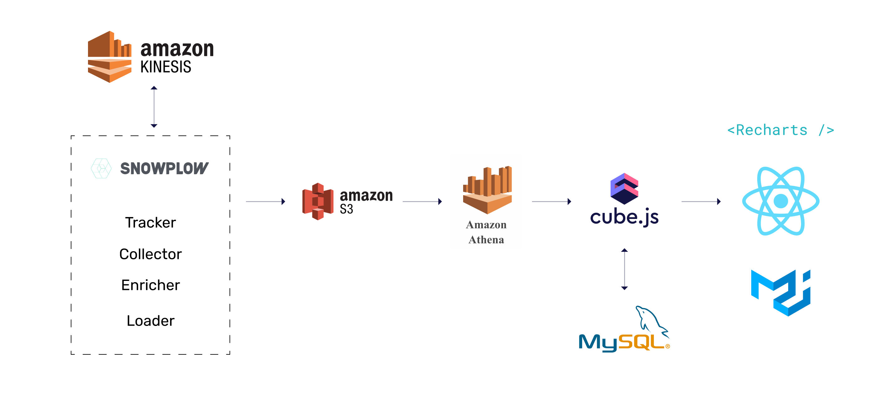
Below you can see the architecture of the application we are going to build. We'll use Snowplow for data collection, Athena as the main data warehouse, MySQL to store pre-aggregations, and Cube as the aggregation and querying engine. The frontend will be built with React, Material UI, and Recharts. Although the schema below shows some AWS services, they can be partially or fully substituted by open-source alternatives: Kafka, MinIO, and PrestoDB instead of Kinesis, S3, and Athena, respectively.
We'll start with data collection and gradually build the whole application, including the frontend. If you have any questions while going through this guide, please feel free to join this Slack Community and post your question there.
Happy hacking! 💻
Data Collection and Storage
We're going to use Snowplow for data collection, S3 for storage, and Athena to query the data in S3.
Data Collection with Snowplow
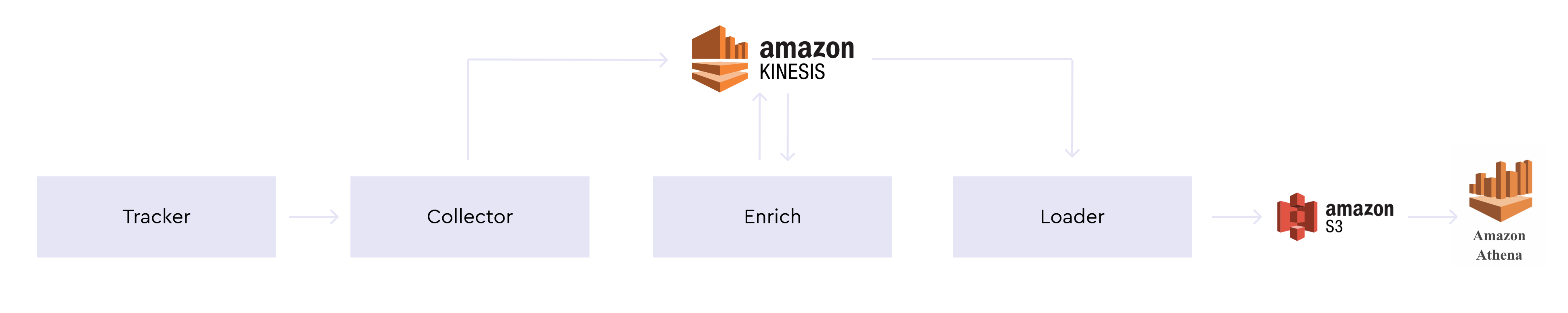
Snowplow is an analytics platform to collect, enrich, and store data. We'll use the Snowplow Javascript tracker on our website, which generates event-data and sends it to the Snowplow Collector to load to S3.
Before loading the data, we'll use Enricher to turn IP addresses into coordinates. We'll use AWS Kinesis to manage data streams for collection, enrichment, and then finally loading into S3. The schema below illustrates the whole process.
Let's start by setting up the tracker. Adding Snowplow's tracker to the website is the same, as adding Google Analytics or Mixpanel tracker. You need to add the asynchronous Javascript code, which loads the tracker itself.
The above snippet references a Snowplow Analytics hosted version of the Snowplow JavaScript tracker v2.10.2 (//d1fc8wv8zag5ca.cloudfront.net/2.10.2/sp.js). Snowplow Analytics no longer hosts the latest versions of the Snowplow JavaScript tracker. It is recommended to self-host sp.js by following the Self-hosting Snowplow.js guide.
For more details about setting up the tracker, please refer to the official Snowplow Javascript Tracker Setup guide.
To collect the data from the tracker, we need to setup Snowplow Collector. We'll use Scala Stream Collector. Here the detailed guide on how to install and configure it. This repository with the Docker images for the Snowplow components is very helpful if you plan to deploy Snowplow with Docker.
Next, we need to install Snowplow Stream Enrich. Same as for collector, I recommend following the official guide.
Finally, we need to have S3 Loader installed and configured to consume records from AWS Kinesis and writes them to S3. You can follow this guide to set it up.
Query S3 with Athena
Once we have data in S3 we can query it with AWS Athena or Presto. We’ll use Athena in our guide, but you can easily find a lot of materials online on how to set up an alternative configuration.
To query S3 data with Athena, we need to create a table for Snowplow events. Copy and paste the following DDL statement into the Athena console. Modify the LOCATION for the S3 bucket that stores your enriched Snowplow events.
Now, we're ready to connect Cube to Athena and start building our application.
Analytics API with Cube
We'll build our analytics API on top of the Athena with Cube. Cube is an open-source analytical API platform which is great for building analytical applications. It creates an analytics API on top of the database and handles things like SQL generation, caching, security, authentication, and much more.
Let's use Cube CLI to create our application. Run the following command in your terminal:
Once run, this command will create a new directory that contains the scaffolding for your new Cube project. Cube uses environment variables starting with CUBEJS_ for configuration.
To configure the connection to Athena, edit the .env file in the react-dashboard folder and specify the AWS access and secret keys with the access necessary to run Athena queries, and the target AWS region and S3 output location where query results are stored.
Next, let's create a sample data schema for our events. Cube uses the data schema to generate SQL code, which will be executed in the database. The data schema is not a replacement for SQL. It is designed to make SQL reusable and give it a structure while preserving all of its power. We can build complex data models with Cube data schema. You can learn more about Cube data schema here.
Create a schema/Events.js file with the following content.
Please, note that we query snowplow_events table from analytics database.
Your database and table name may be different
Now, we can start Cube server by running npm run dev and open http://localhost:4000/. In development mode, Cube will run its Developer Playground. It is an application to help you explore the data schema and send test queries.
Let's test our newly created data schema! Cube accepts queries as JSON objects in the specific query format. Playground lets you visually build and explore queries. For example, we can construct the test query to load all the events over time. Also, you can always inspect the underlying JSON query by clicking JSON Query button.
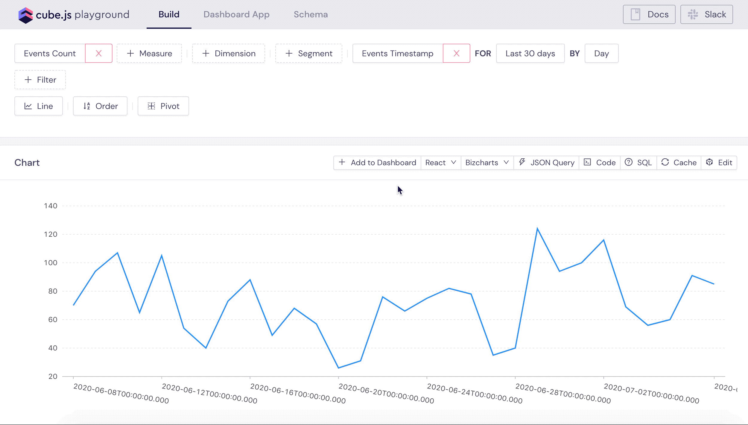
You can explore other queries as well, test different charting libraries used to visualize results and explore the frontend JavaScript code. If you are just starting with Cube I recommend checking this tutorial as well.
In the next part, we'll start working on the frontend application and will steadily build out our data schema.
Frontend App with React and Material UI
We can quickly create a frontend application with Cube, because it can generate it using open-source, ready-to-use templates. We can just pick what technologies we need and it gets everything configured and ready to use. In the Developer Playground, navigate to the Dashboard App and click Create Your Own. We will use React, Material UI, and Recharts as our charting library.

It will create the dashboard-app folder with the frontend application inside the project folder. It could take several minutes to download and install all the dependencies. Once it is done, you can start Dashboard App either from "Dashboard App" tab in the Playground or by running npm start inside the dashboard-app folder.
We're going to build the Audience Dashboard and you can check the source code of the rest of application on Github.
We'll start by building the top over time chart to display page views, users or sessions with different time granularity options.
Page Views Chart
Let's first define the data schema for the page views chart. In our
database page views are events with the type of page_view and platform web.
The type is stored in column called event. Let's create a new file for
PageViews cube.
Create the schema/PageViews.js with the following content.
We've created a new cube and extended it from existing Events cube. This way
PageViews is going to have all the measures and dimensions from Events cube,
but will select events only with platform web and event type page_view.
You can learn more about extending cubes here.
You can test out newly created PaveViews in the Cube Plyground. Navigate to
the Build tab in the Playground, select *Page Views Count" in the measures
dropdown and you should be able to see the chart with your page views.

Let's add this chart to our Dashboard App. First, we'll create the
<OverTimeChart /> component. This component's job is to render the chart as
well as the switch buttons to let users change date's granularity between
hour, day, week, and, month.
Create the the dashbooard-app/src/component/OverTimeChart.js with the
following content.
We are almost ready to plot the page views chart, but before doing it, let's customize
our chart rendering a little. This template has created the <ChartRenderer />
component which uses Recharts to render the chart.
We're going to change formatting, colors and general appearance of the chart.
To nicely format numbers and dates values we can use Numeral.js and Moment.js packages respectively. Let's install them, run the following command inside the dashbooard-app folder.
Next, make the following changes in the
dashbooard-app/src/components/ChartRenderer.js file.
The code above uses Moment.js and Numeral.js to define formatter for axes and tooltip, passes some additional properties to Recharts components and changes the colors of the chart. With this approach you can fully customize your charts' look and feel to fit your application's design.
Now, we are ready to plot our page views chart. The template generated the
<DashboardPage /> component which is an entry point of our frontend application. We're
going to render all our dashboard inside this component.
Replace the content of the dashboard-app/src/pages/DashboardPage.js with the
following.
The code above is pretty straightforward - we're using our newly created
<OverTimeChart /> to render the page views chart by passing the Cube JSON
Query inside the vizState prop.
Navigate to the http://localhost:3000/ in your browser and you should be able to see the chart like the one below.

Adding Sessions and Users Charts
Next, let's build sessions chart. A session is defined as a group of interactions one user takes within a given time frame on your app. Usually that time frame defaults to 30 minutes, meaning that whatever a user does on your app (e.g. browses pages, downloads resources, purchases products) before they leave equals one session.
As you probably noticed before we're using the ROW_NUMBER window function in our Events cube definition to calculate the index of the event in the session.
We can use this index to aggregate our events into sessions. We rely here on the domain_sessionid set by Snowplow tracker, but you can also implement your own sessionization with Cube to have more control over how you want to define sessions or in case you have multiple trackers and you can not rely on the client-side sessionization. You can check this tutorial for sessionization with Cube.
Let's create Sessions cube in schema/Sessions.js file.
We'll use Sessions.count measure to plot the sessions on our over time chart.
To plot users we need to add one more measure to the Sessions cube.
Snowplow tracker assigns user ID by using 1st party cookie. We can find this
user ID in domain_userid column. To plot users chart we're going to use the existing Sessions cube, but we will count not all the sessions, but only unique by domain_userid.
Add the following measure to the Sessions cube.
Now, let's add the dropdown to our chart to let users select what they want to plot: page views, sessions, or users.
First, let's create a simple <DropDown /> component. Create the dashboard-app/src/components/Dropdown.js file with the following content.
Now, let's use it on our dashboard page alongside adding new charts for
users to select from.
Make the following changes in the dashboard-app/src/pages/DashboardPage.js
file.
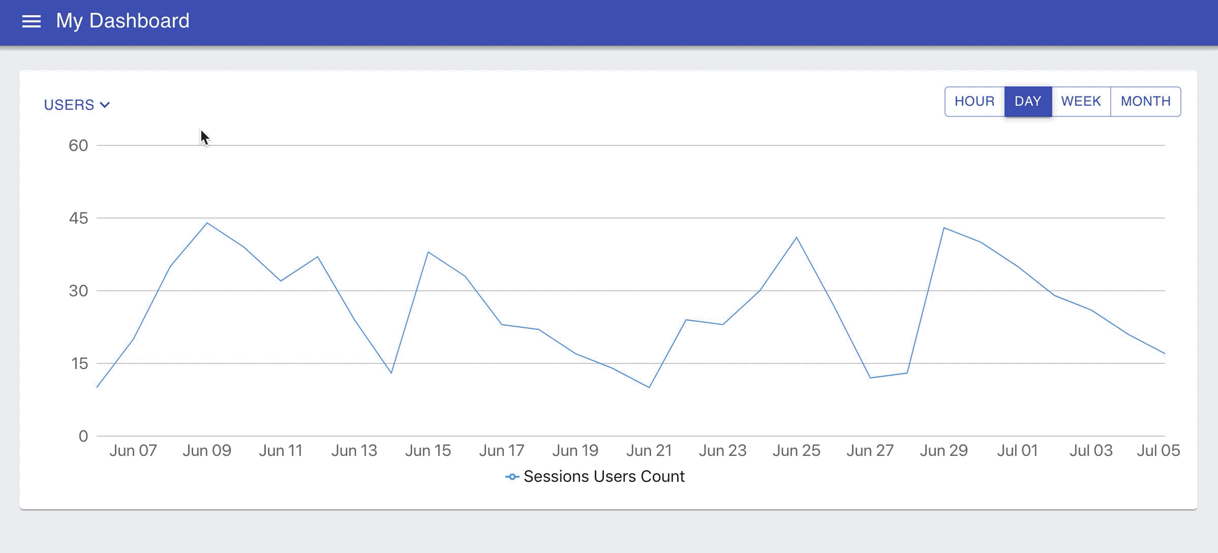
Navigate to http://localhost:3000/ and you should be able to switch between charts and change the granularity like on the animated image below.
In the next part we'll add more new charts to this dashboard! 📊🎉
Building a Dashboard
In the previous part we've created our basic data schema and built first few charts. In this part we'll add more measures and dimensions to our data schema and build new charts on the dashboard.
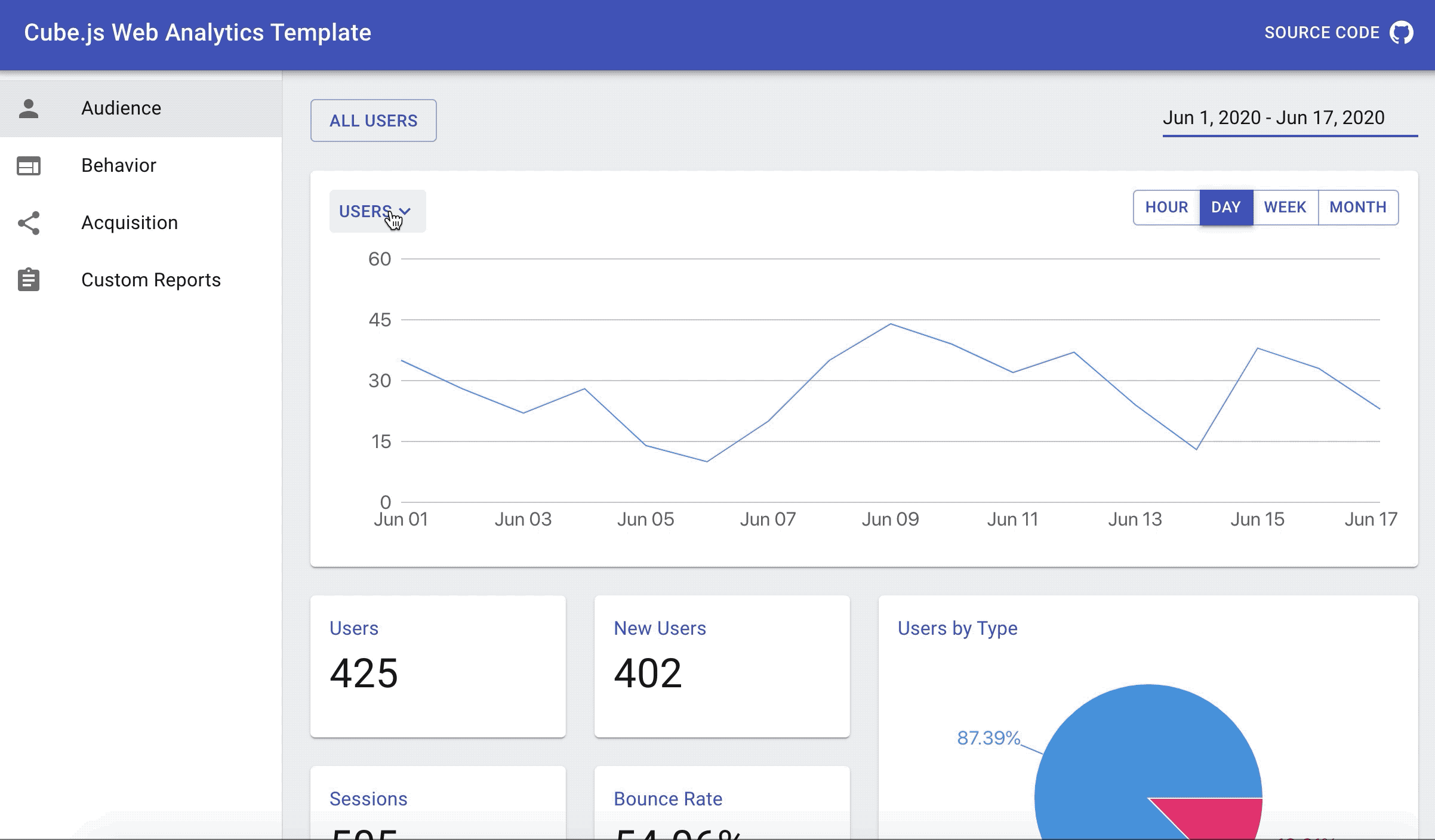
We are going to add several KPI charts and one pie chart to our dashboard, like on the schreenshot below.
Let's first create <Chart /> component, which we're going to use to render
the KPI and Pie charts.
Create the dashboard-app/src/components/Chart.js file with the following
content.
Let's use this <Chart /> component to render couple KPI charts for measures we already
have in the data schema: Users and Sessions.
Make the following changes to the dashboard-app/src/components/DashboardPage.js file.
Refresh the dashboard after making the above changes and you should see something like on the screenshot below.

To add more charts on the dashboard, we first need to define new measures and dimensions in our data schema.
New Measures and Dimensions in Data Schema
In the previous part we've already built the foundation for our data schema and covered some topics like sessionization. Now, we're going to add new measures on top of the cubes we've created earlier.
Feel free to use Cube Playground to test new measures and dimensions as we adding them. We'll update our dashboard with all newly created metrics in the end of this part.
Returning vs News Users
Let's add a way to figure out whether users are new or returning. To
distinguish New users from Returning we're going to use session's index
set by Snowplow tracker - domain_sessionidx.
First, create a new type dimension in the Sessions cube. We're using
case property to make this dimension return either New or Returning based on the
value of domain_sessionidx.
Next, let's create a new measure to count only for "New Users". We're going to define newUsersCount measure by using filters
property to select
only new sessions.
Add the following measure to the Sessions cube.
We'll use type dimension to build "New vs Returning" pie chart. And newUsersCount measure for "New Users" KPI chart. Feel free to test these measure and dimension in the Playground meanwhile.
Average Number of Events per Session
To calculate the average we need to have the number of events per session first. We can achieve that by creating a subQuery dimension. Subquery dimensions are used to reference measures from other cubes inside a dimension.
To make subQuery work we need to define a relationship between Events and Sessions cubes. Since, every event belongs to some session, we're going to define belongsTo join. You can learn more about joins in Cube here.
Add the following block to the Events cube.
We'll calculate count of events, which we already have as a measure in the Events cube, as a dimension in the Sessions cube.
Once, we have this dimension we can easily calculate its average as a measure.
Average Session Durarion
To calculate the average session duration we need first calculate the duration of sessions as a dimension and then take the average of this dimension as a measure.
To get the duration of the session we need to know when it
starts and when it ends. We already have the start time, which is our time
dimension. To get the sessionEnd we need to find the timestamp of the last
event in the session. we'll take the same approach here with the subQuery dimension as we did for number of events per session.
First, create the following measure in the Events cube.
Next, create the subQuery dimension to find the last max timestamp for the
session. Add the following dimension to the Sessions cube.
Now, we have everything to calculate the duration of the session. Add the
durationSeconds dimension to the Sessions cube.
The last step is to define the averageDurationSeconds measure in the
Sessions cube.
In the above definition we're also using measure's meta
property. Cube has several built-in measure
formats like
currency or percent, but it doesn't have time format. In this case we can use
meta property to pass this information to the frontend to format it properly.
Bounce Rate
The last metric for today is the Bounce Rate.
A bounced session is usually defined as a session with only one event. Since we’ve already defined the number of events per session, we can easily add a dimension isBounced to identify bounced sessions to the Sessions cube. Using this dimension, we can add two measures to the Sessions cube as well - a count of bounced sessions and a bounce rate.
Adding New Charts to the Dahsboard
Now, we can use these new measures and dimensions to add more charts to our dashboard. But before doing it, let's make some changes on how we render the KPI chart. We want to format the value differently depending on the format of the measure - whether it is number, percent or time.
Make the following changes to the dashboard-app/src/components/ChartRenderer.js file.
Finally, we can make a simple change to the <DashboardPage /> component. All
we need to do is to update the list of queries and chart items on the dashboard
with new metrics: New Users, Average Events per Sessions, Average Sessions
Duration, Bounce Rate and the breakdown of Users by Type.
Make the following changes to the dashboard-app/src/pages/DashboardPage.js file.
That's it for this chapter. We have added 7 more new charts to our dashboard. If you navigate to the http://localhost:3000/ you should see the dashboard with all these charts like on the screenshot below.

In the next part, we'll add some filters to our dashboard to make it more interactive and let users slice and filter the data.
Adding Interactivity
Currently all our charts are hardcoded to show the data for the last 30 days. Let's add the date range picker to our dashboard to let users change it. To keep things simple, we'll use the date range picker package we created specifically for this tutorial. Feel free to use any other date range picker component in your application.
To install this package run the following command in your terminal inside the dashboard-app folder.
Next, update the <DashboardPage /> in the
dashboard-app/src/pages/DashboardPage.js file the following content.
In the code above we've introduced the withTime function which inserts values from
date range picker into every query.
With these new changes, we can reload our dashboard, change the value in the date range picker and see charts reload.
As you can see, there is quite a delay to load an updated chart. Every time we change the values in the date picker we send 6 new SQL queries to be executed in the Athena. Although, Athena is good at processing large volumes of data, it is bad at handling a lot of small simultaneous queries. It also can get costly quite quickly if we continue to execute queries against the raw all the time.
In the next part we'll cover how to optimize performance and cost by using Cube pre-aggregations.
Performance and Cost Optimization
We've created our dashboard with a date filters in previous parts. In this part we're going to work on performance and cost optimization of our queries.
Athena is great at handling large datasets, but will never give you a sub-second response, even on small datasets. As we saw previously, it leads to a wait time on dashboards and charts, especially dynamic, where users can select different date ranges or change filters.
To solve that issue we'll use Cube external pre-aggregations. We'll still leverage Athena's power to process large datasets, but will put all aggregated data into MySQL. Cube manages all the process of building and maintaining the pre-aggregations, including refreshes and partitioning.
Connecting to MySQL
To use the external pre-aggregations feature, we need to configure Cube to connect to both Athena and MySQL, as well as specify which pre-aggregation we want to build externally. We've already configured the connection to Athena, so all we need to setup now is MySQL connection.
First, we need to install Cube MySQL driver. Run the following command in the root folder of your project.
Next, let's edit our .env file in the root folder of the project.
Add the following configuration options with relevant credentials to connect to MySQL. Please note that in order to build pre-aggregations inside MySQL, Cube should have write access to the stb_pre_aggregations schema where pre-aggregation tables will be stored.
That is all we need to let Cube connect to MySQL. Now, we can move forward and start defining pre-aggregations inside our data schema.
Defining Pre-Aggregations in the Data Schema
The main idea of the pre-aggregation is to create a table with already aggregated data, which is going to be much smaller than the original table with the raw data. Querying such table is much faster that querying the raw data. Additionally, by inserting this table into external database, like MySQL, we'll be able to horizontally scale it, which is especially important in multi-tenant environments.
Cube can create and maintain such tables. To instruct it to do that we need to
define what measures and dimensions we want to pre-aggregate in the data schema.
The pre-aggregations are defined inside the preAggregations block. Let's
define the first simple pre-aggregation first and then take a closer look how it
works.
Inside the Sessions cube in the data schema add the following block.
The code above will instruct Cube to create the pre-aggregation called
additive with two columns: Sessions.count and Sessions.timestamp with
daily granularity. The resulting table will look like the one below.
Also, note that we specify external: true property, which tells Cube to load that
table into MySQL, instead of keeping it inside Athena.
The refreshKey property defines how Cube should refresh that table. In our
case, the refresh strategy is quite simple, we just configure that
pre-aggregation to refresh every 5 minute. Refresh strategy can be much
complicated depending on the required use case, you can learn more about it in
the docs.
Now, with the above pre-aggregation in place, the following query will be executed against the pre-aggregated data and not raw data.
You can use "Cache" button in the Playground to check whether the query uses pre-aggregation or not.

Background Scheduled Refresh
You can configure Cube to always keep pre-aggregations up-to-date by
refreshing them in the background. To enable it we need to add
scheduledRefresh: true to pre-aggregation definition. Without this flag pre-aggregations are always built on-demand.
Update your pre-aggregation to enable scheduledRefresh.
Refresh Scheduler isn't enabled by default. We need to trigger it externally.
The simplest way to do that would be to add the following configuration option to the
.env file:
That is the basics we need to know to start configuring pre-aggregations for our example. You can inspect query by query in your dashboard and apply pre-aggregations to speed them up and also to keep your AWS Athena cost down.
Congratulations on completing this guide! 🎉
You can get the source code is available on Github.
I’d love to hear from you about your experience following this guide. Please send any comments or feedback you might have in this Slack Community. Thank you and I hope you found this guide helpful!